My Work
Efficient Work App Design
Overview
Role
UX/UI Designer
Tools
Figma
Year
2023
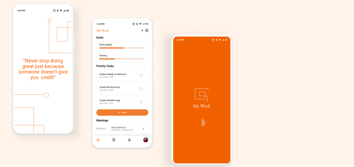
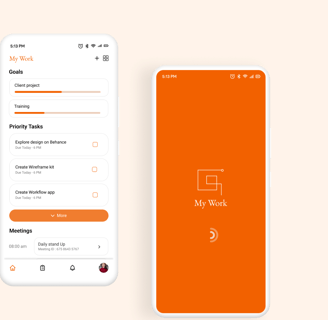
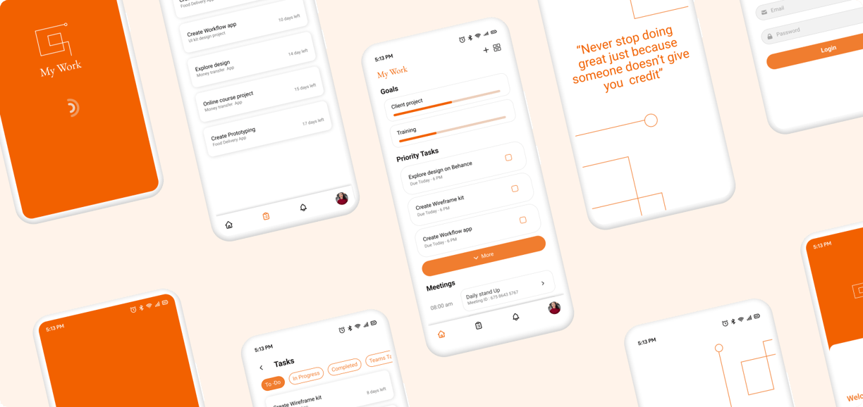
My Work app is your personal productivity companion, designed to infuse positivity into your work routine. In addition to the seamless integration of daily goals, tasks, and essential communication functions like email, chat, meeting and a dynamic calendar, Every time you open the application, be greeted by an inspiring motivational message, which will help you experience productivity and motivation combined in My Work.
Problem
Currently, people are facing problem with scattered apps for task management, goal tracking and communication. This causes confusion and reducing workflow efficiency. Lack of motivation adds to the challenge, leading to an unpleasant work routine.
Solution
An integrated application combining goal tracking, task management, and essential communication functions in a user-friendly interface. With the unique feature of presenting an inspiring motivational message each time it is opened, fostering a positive mindset. By providing a unified platform, The application aims to enhance the overall work experience, infusing both productivity and motivation into professionals' daily routines, thereby optimizing workflow and job satisfaction.
Process
User research
User Interviews
During my research, I conducted multiple interviews with employees from various departments and roles to gather the necessary information to understand their daily workflows, the applications they use, and the challenges they face in managing tasks. I made note of their emotional reactions to the current fragmented application environment.
KEY QUESTIONS:
Can you walk me through a typical day in your role?
Can you describe a situation where the current scattered applications caused frustration or confusion?
How do you stay motivated during challenging work periods?
Are there specific elements that could make your work routine more enjoyable?
High- Must Have
As a user, I want integrated communication tools within the app so that I can collaborate with my team members in real time and avoid disjointed communication.
As a user, I want to receive daily motivational messages within the app So that I can stay positive, motivated, and enthusiastic about my work.
As a user, I want to have a central place to manage all my tasks efficiently So that I can track my tasks seamlessly.
Medium- Nice To Have
As a user, I want AI-driven insights providing data-driven recommendations for task prioritization and goal achievement.
As a user, I want customizable themes and color schemes so that I can personalize the app to my preference.
Following interviews with multiple employees, I categorized user needs into essential high-priority requirements and secondary nice-to-have features.
Competitive Analysis
I evaluated some of the mobile applications to understand some key designs that we could incorporate and avoid. I have noticed that
Many of the applications have tasks and meetings on their home page to provide a brief overview of their work.
A 'jump bar' for tasks to get from section to section without endless scrolling.
Lack of motivational factor in the application.
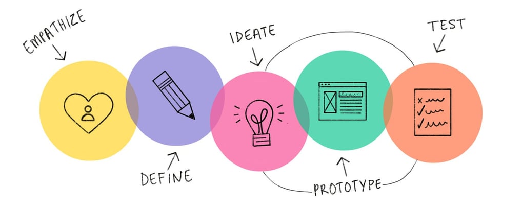
Ideate
Brainstroming
A comprehensive solo brainstorming session is conducted to generate and refine ideas for key features and design elements. I began by setting a clear objective: to identify features that seamlessly integrate daily goals, tasks, communication tools, and motivational elements. Using various brainstorming techniques such as mind mapping, free writing, and sketching, I explored a wide range of possibilities. I generated ideas like integrating Google Calendar for dynamic scheduling, customizable motivational messages, and robust communication tools including email and chat. After organizing and evaluating these ideas based on feasibility and impact, I selected the most promising ones for further development. This structured approach allowed me to create detailed descriptions and initial wireframes for each feature, ensuring a cohesive and user-centric design.
User Flows
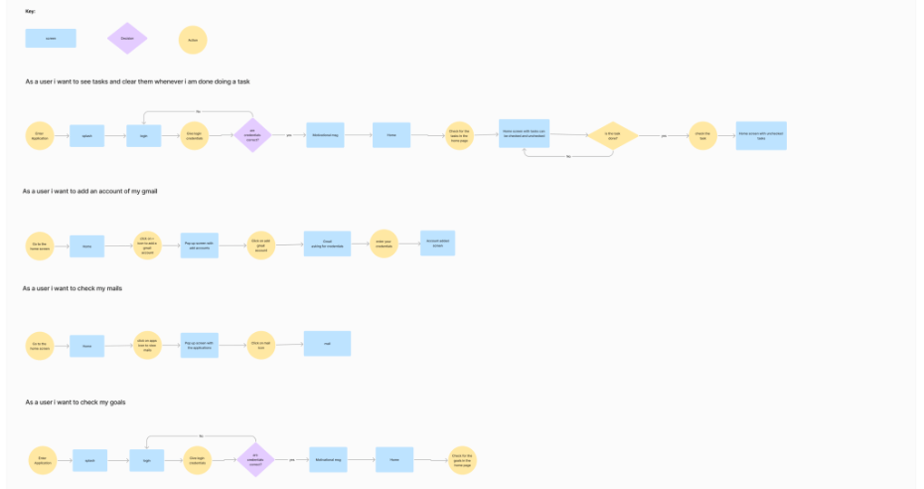
To illustrate how users will interact with my solution, I have created several user flows.
Having identified user needs and mapped out their journeys and extracting insights from competitive analysis, I then moved on to how key features and other elements can be organised in the frames.
Low - Fi
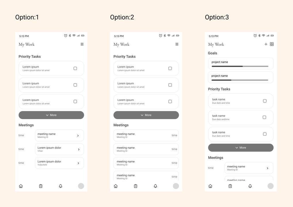
Designing Home Page
I started by designing the home page with the objective of providing users with a quick overview of their work at a glance. Drawing insights from user research and competitor study I identified two key elements tasks and meetings to be included on the homepage. I then experimented with different layouts to effectively organize these priority elements and enhance the user experience.
After designing multiple Low-Fi's for the homepage and gathering feedback from different users the decision was made to proceed with option 3
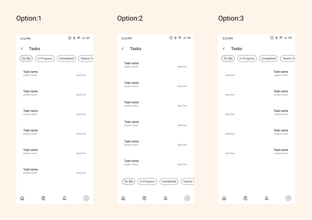
Designing Tasks page
I noticed a trend in benchmarking of competitors using a 'jump bar' either at the side or top of the page to allow a user to jump easily from section to section. which made sense as it prevents the page from getting too long. Therefore I started exploring ways to implement it in the task page
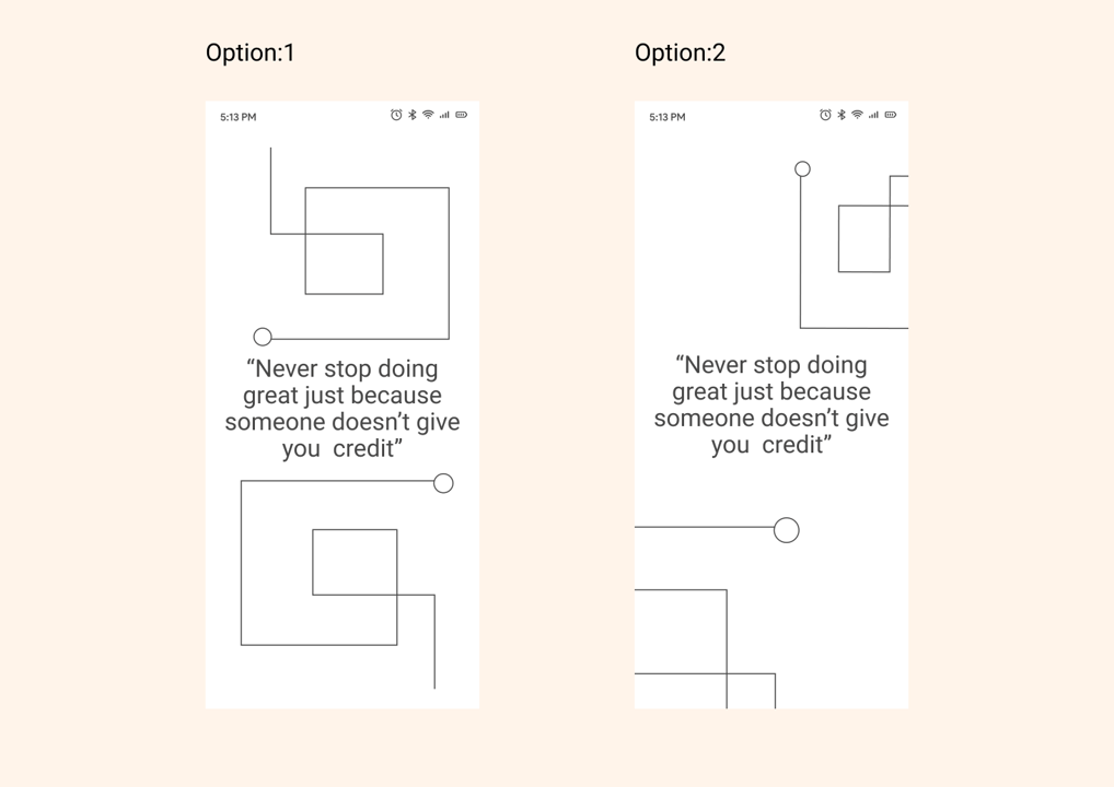
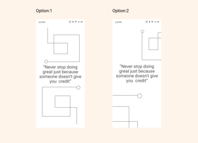
Designing Motivational page
During the competitive analysis, I observed a lack of motivational elements in existing solutions. Recognizing the significance of motivation from the users to sustain their efforts, I introduced a dedicated motivational page and decided to include a motivational quote and the logo to serve as a reminder to reach their goals. Following that I began exploring different ways to implement this page effectively.
To ensure readability and maintain a distinct visual appeal I chose Roboto font in contrast to EB Garamond font
Typography


Icons
In order to maintain a minimalistic interface, I have designed icons with thin and sleek designs
Color Exploration
Orange is the primary color chosen for its association with creativity, productivity, and innovation


Hi-Fi
After finalizing the Low-fi wireframes by selecting the preferred options I proceeded to develop Hi-Fi wireframes by following the style guide that I had created for My Work app
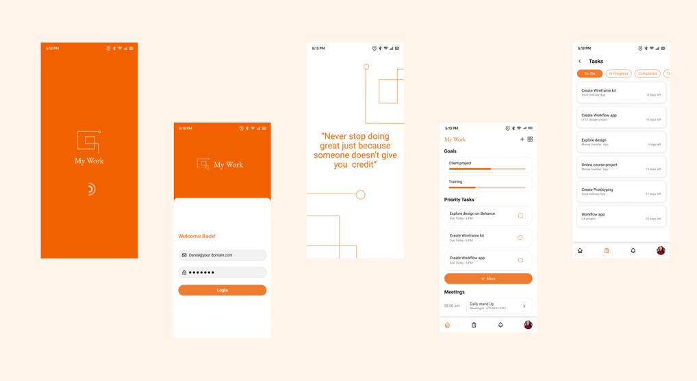
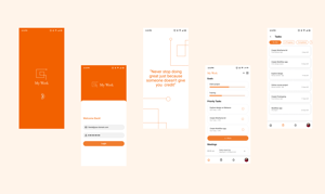
Prototype
After creating the Hi-fi design, I used Figma to prototype the wireframes. This helped us to bring the platform to life and provide a more realistic representation.
Usability Testing
With the help of prototypes created, I conducted usability testing which helped me understand users' ability to navigate through the system and successfully complete specific tasks.
Results and Take aways
Working on my own project is an extremely steep learning curve. It was an eye-opening experience that taught me about when and where to focus. Additionally, I have received positive feedback from users about the Inclusion of motivational messages led to a significant boost in motivation, contributing to a positive work environment.
Some key takeaways from this project are:
Focus on the problem. At the end of the day, it is your users pains that you will be solving for so keeping that front of mind is important as it's easy to lose sight of this when you're bogged down in the day to day.
Iterative Problem Solving: By continuously identifying and addressing issues through a dynamic and iterative process, I refined the app's functionality, ensuring a seamless and evolving user experience.
Let's talk
roshinigangavaram@gmail.com